print / photoshop, indesign, illustrator
2019
bossa nova typography poster

course / Typography 2
typefaces / Baskerville, Didot, Univers, Futura, Avenir Next
dimensions / 24x36”
typefaces / Baskerville, Didot, Univers, Futura, Avenir Next
dimensions / 24x36”
process
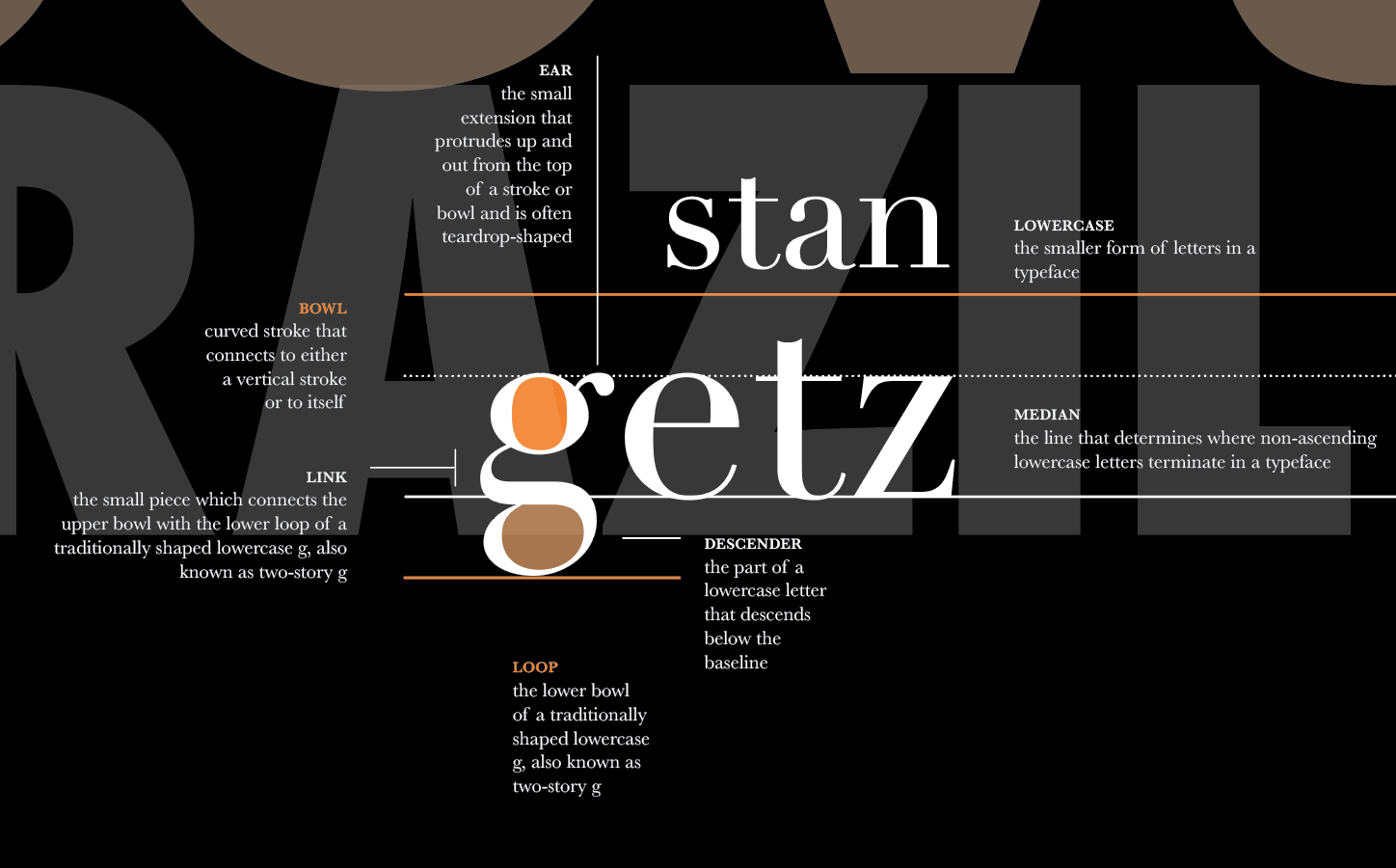
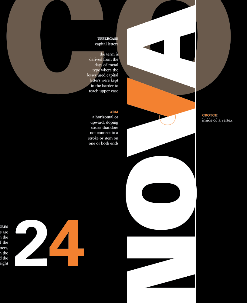
This type information poster was assigned as a project for Typography 2. The objective of the project was to create a poster that explores the visual dialogue between structured and unstructured typographic elements within a grid system.
Type as image is prioritized above type as information. We were given typographic terms to define and place on the poster, while making sure that the poster itself draws the viewer in with form and imagery. I chose bossa nova as a theme to guide type as image.
I used orange to highlight elements of letterforms and create contrast. Orange is reminiscent of bossa nova album covers; its prominence in Stan Getz’ album covers helped inform my color choice.
Definitions are set at 10pt on this 24x36” poster and grouped to convey a form, while signaling to the viewer that there is more information to be found. I added Stan Getz’ and Joao Gilberto’s album cover art to create rhythm.
poster details
![]()
![]()
![]()
past iterations
![]()
![]()
![]()

past iterations


